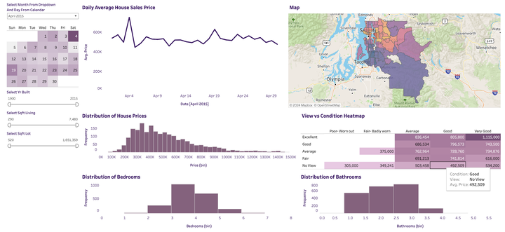
This dashboard visualizes and analyzes housing sales data for King County, Washington. The dashboard features a calendar widget, line chart, map, histograms, and a heatmap, providing a user-friendly interface to explore the dataset. The purpose is to understand trends in housing prices and identify relationships between price and other attributes like number of bedrooms/bathrooms, square footage, view, condition, etc.
The dashboard allows users to filter the data by month and day to see how prices change over time. Additional filters for year built, square feet living area, and square feet lot area allow further slicing of the data.
Analysis
The dashboard consists of the following visualizations:
- Line chart showing average price over time
- Map showing average price by ZIP code, colored by price
- Histogram showing distribution of house prices
- Histograms for distribution of number of bedrooms and bathrooms
- Heatmap showing average price by view and condition
The visualizations allow us to identify trends like:
- Prices increasing over time
- Areas with higher concentrations of expensive houses
- Most houses having 2-4 bedrooms and 1-3 bathrooms
- Higher prices for better views and conditions
Instructions
The dashboard can be filtered in the following ways:
- Select month and day from calendar to filter all visualizations to that time period
- Use sliders for year built, square feet living area, and square feet lot area to filter the bottom 4 visualizations
- Hover over marks in the visualizations to see more details
The dashboard is interactive and allows slicing data in different ways to uncover insights.
Dashboard
To learn more about the dashboard click on the github icon at the top and to view the dashboard click on the tableau button at the top.