A Visual Impact on New York's Creative Pulse
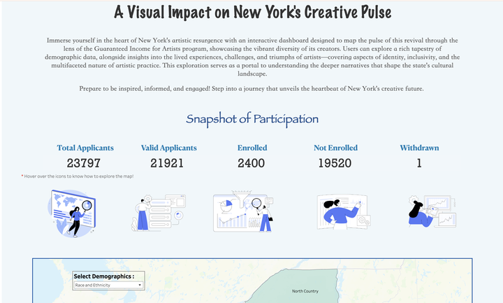
A Visual Impact on New York’s Creative Pulse encapsulates the essence of the city’s artistic reawakening, depicted through an innovative interactive dashboard fueled by the Guaranteed Income for Artists program. This visualization not only highlights the demographic diversity and narratives of New York’s artists but also brings to the forefront the profound interplay of identity, inclusivity, and artistic endeavors.
Methodology
In crafting our interactive tableau data visualization, we relied on the Guaranteed Income dataset as our foundation. Our methodology was meticulous, prioritizing data integrity through extensive cleaning (especially on the geographical aspects) and preparation processes.
Approaches performed in Python:
- Removed Invalid Entries
- Preparing geographical agttributes to outline the latitude and longitude
- Data Cleaning
Approaches performed in Excel:
- Our strategy in Excel involved disaggregating multi-response variables across separate sheets, linked via participant IDs.
- This crucial step shifted our data from a wide to a long format, maintaining the integrity of each participant’s responses across multiple variables.
- Geographic data underwent a rigorous validation process, cross-referencing zip codes with a detailed lookup table to correct city names and ensure geographical accuracy.
Final Visualization: tableau –
- We used calculated fields to calculate KPIs.
- Our map visualizations leveraged Tableau’s dynamic zone visibility, enabling users to drill down from regions to counties, and counties to cities with seamless interactivity. a. We made use of parameters and actions in Tableau to create interactivity between region, county, and city maps b. Simultaneously we can view the demographic information as well as the count of enrolled participants for the selected geographical area by hovering. c. For the hovering effect, we used viz in the tooltip d. The end user can select from the demographic dropdown
- To explore the overall New York City nature of the applicants and for the variables that were multi-response we created a narrative of visualizations such as bubble charts, treemaps, etc
Dashboard
To learn more about the dashboard and to view the dashboard click on the tableau button at the top.